A Proposal for Cycling Infrastructure Improvements Along the IBX Using STRAVA Data
A Proposal for Cycling Infrastructure Improvements Along the IBX Using STRAVA Data
Authors: Elif Ensari Sucuoglu, Joao Paulouro and Eric Goldwyn, Published in: February, 2026
As part of the 2025 cohort of the Strava Metro for Academic Researchers Program, our team at the Marron Institute of NYU explored Strava Metro cycling activity data around the Interborough Express (IBX) corridor. This report synthesizes those findings into recommendations for improving the cycling infrastructure to support safe, convenient access to proposed IBX stations and, ultimately, future IBX ridership. For more information on the IBX project, please see our previous research posts.
Walkability, and to a lesser extent, cycling infrastructure around transit stations has been extensively studied within Transit-Oriented Development (TOD) research and is widely recognized as critical to supporting demand along transit corridors. Walking and cycling are active modes of transportation that provide access to jobs, education, health care, food, recreation, and other resources in urban centers, and they also complement public transit by enabling first- and last-mile access and transfers between lines. The quality of the built environment plays a central role in determining whether people choose to walk or cycle rather than rely on private cars, which are polluting, inefficient users of urban space and discourage active travel.
For both modes, the proximity of destinations, the structure of the street network, and the diversity and intensity of street-level uses are among the most influential factors shaping travel behavior. For cycling, the availability of bicycles, bike lanes and parking, as well as the quality and continuity of those facilities are particularly important, while for walking, factors related to safety, comfort, and street-level attractiveness strongly influence whether people choose to walk to their destination.
We therefore consider improvements to walking and cycling conditions around IBX station areas to be essential to the success of the project, as public transit, walking, and cycling function as an integrated system. People are more likely to walk in a city like New York where public transit options are abundant, while walkable streets make it easier and more attractive to reach nearby transit stops. Similarly, the availability of safe bike lanes, bike-share options, and secure bike parking can significantly expand the effective catchment area of transit stations, making it feasible to access stations or transfer between lines even when distances exceed a comfortable walk. With this objective in mind, we explored the walking and cycling data provided to us by STRAVA Metro and analyzed existing cycling activity around proposed IBX stations to identify opportunities for targeted infrastructure improvements that can expand access to the corridor.
Strava is a mobile application used to track walking, running, cycling, and other physical activity, with more than 180 million users across 185+ countries worldwide. Using mobile phones or wearable devices such as smartwatches, users record location, distance, duration, and other activity-related attributes. For the purposes of this study, the most relevant component of the dataset is the anonymized, aggregated location-based activity counts, which Strava provides to academic researchers through the Strava Metro for Academic Researchers Program.
At the same time, it is well established that Strava data is not representative of the general population. Strava users constitute a small subset of overall cyclists and pedestrians and are more likely to be male, within the age group 25-44 and according to our findings, employed in the knowledge-sector and less likely to own cars. One multi-city study comparing Strava counts with city-recorded cycling volumes found that Strava activity represented between 1 in 42 and 1 in 271 actual cycling trips across five North American cities. A separate study that included both cycling and walking trips in Oslo found Strava to capture between 0.9% and 4.4% (1 in 111 to 1 in 23 ) of actual average monthly trips, depending on the month. A literature review found an average of 5% representativeness across studies that analyzed STRAVA data.
Because the relationship between Strava activity and total walking and cycling volumes varies substantially by geography and season, estimating total activity levels in New York City would require a city-specific calibration model, similar to those developed in studies mentioned above. Such models typically rely on multiple counters placed on streets with a wide range of activity levels and traffic conditions. While developing such a model is beyond the scope of this report, we do compare Strava cycling counts with bicycle counts collected by the New York City Department of Transportation (DOT) at locations where counters are available (Figure 1).
After excluding the top 25% of observations and street segments with fewer than five daily Strava counts, we find that Strava data represents between 1 in 38 and 1 in 322 cycling trips and 1 in 35 to 1 in 1513 pedestrian trips recorded by DOT counters (Figures 2 & 3). The substantially lower representation of walking activity likely reflects the fact that walking is far more ubiquitous than cycling and therefore less likely to be recorded. Accordingly, we only present an analysis based on the cycling data and recommendations pertaining to the cycling infrastructure. See the Appendix Section for details on our aggregation and comparison methodology.
Keeping these caveats in mind, we do not treat Strava counts as estimates of total cycling volumes. Instead, we use the data to identify relative patterns of activity, such as commonly used routes, spatial concentrations of activity, and areas where people are more likely to cycle compared to others. This approach allows us to assess whether differences in infrastructure conditions and the built environment are associated with higher levels of observed activity, even if that activity reflects a limited and non-representative demographic. While future work may involve conducting additional counts on corridors without existing DOT counters, for the purposes of this study, we treat Strava data as a high-resolution, citywide signal of where recreational cycling activity already occurs and where connectivity improvements may be most impactful for both direct access to the IBX stations as well as connecting the corridor to the core cycling infrastructure of the city.
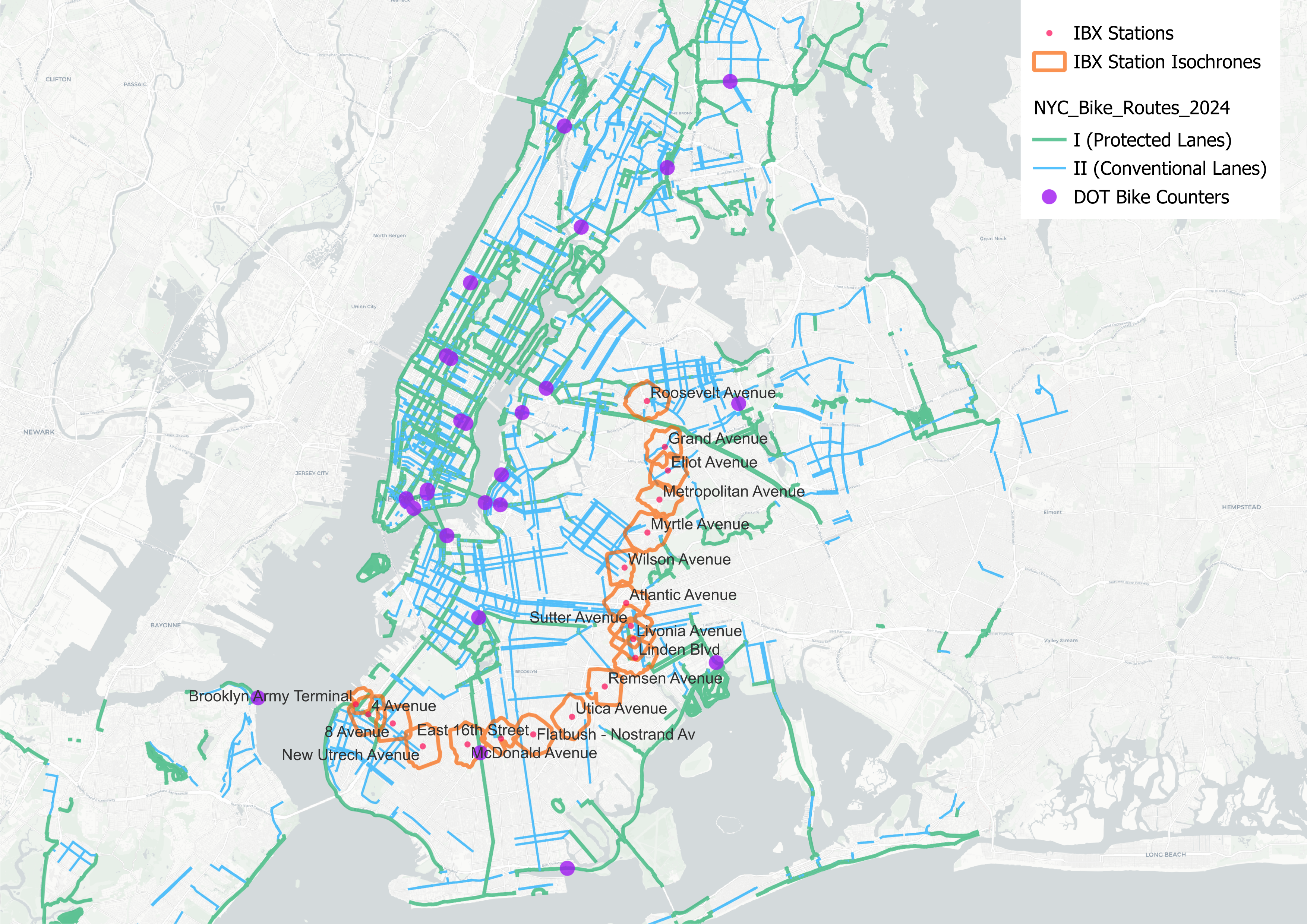
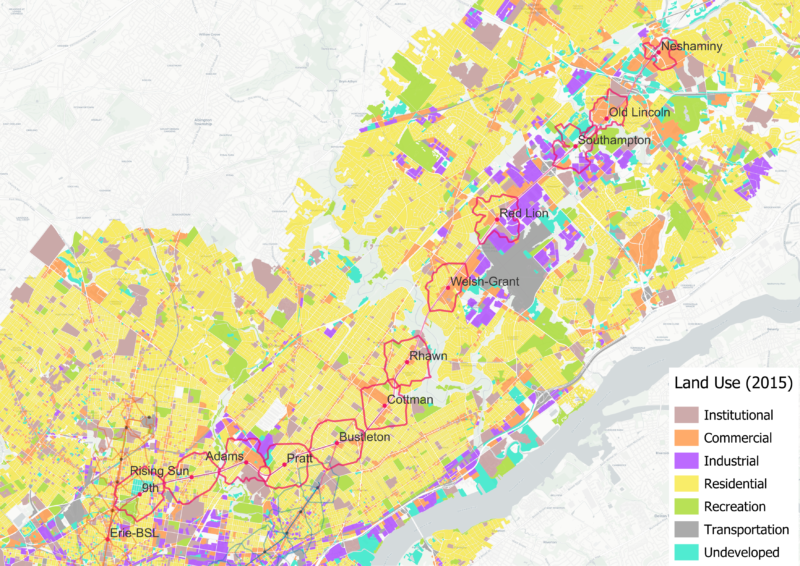
Figure 1: DOT Bike Counter Locations, Bike Lanes and IBX Station Isochrones
Strava Metro also provides disaggregated information by gender, age, and trip purpose. However, we found that these more detailed subsets exhibited lower correlations with DOT counts, likely due to smaller sample sizes. For this reason, we rely primarily on average daily activity counts, calculated by dividing annual counts by 366 for the year 2024.
Despite these limitations, Strava Metro’s datasets provide consistent, citywide cycling activity information at the street-segment level. While capturing only a fraction of total activity, it offers valuable insight into route choice, network gaps, and latent demand. Our findings further indicate that Strava users in New York City disproportionately choose to ride on streets with existing bike lanes or off-street cycling infrastructure. This suggests that cyclists in New York prefer to use bike lanes when available, and that cycling on streets without dedicated facilities often reflects a lack of viable alternatives. Accordingly, our recommendations for improving connectivity between IBX station areas and the existing cycling network are informed by both observed route use and activity occurring despite inadequate or missing infrastructure.
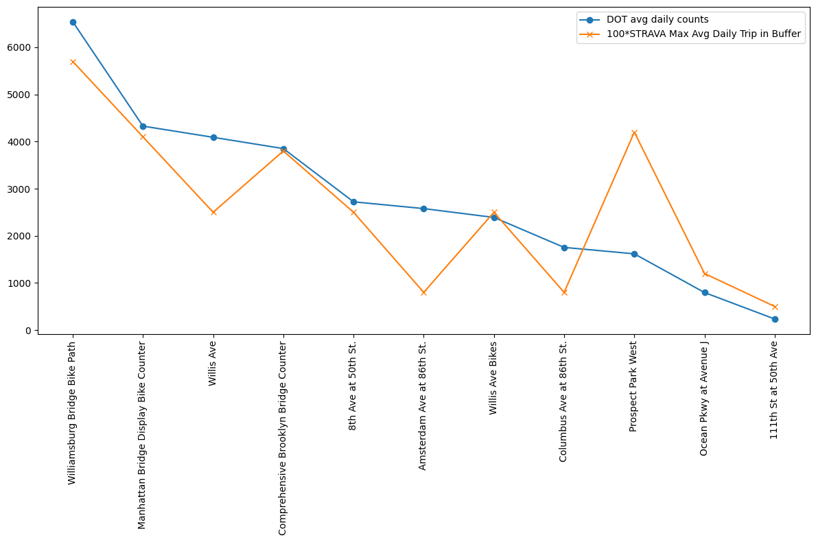
Figure 2: Average Daily Cycling Trips Recorded by DOT Counters and STRAVA Users
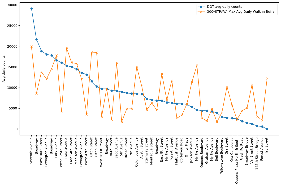
Figure 3: Average Daily Walking Trips Recorded by DOT Counters and STRAVA Users
Distribution of Cycling Activity Along the Corridor and Contributing Factors
We used STRAVA data in two ways. First, we aggregated cycling counts on Open Street Map (OSM) segments to street segments. Second, we aggregated cycling counts within each 10-minute isochrone- defined as the area reachable by a 10-minute walk from a station location in all directions- for all NYC subway stations and the proposed IBX locations. This approach allowed us to compare cycling activity across station areas, as well as associated demographic and built-environment characteristics known to influence travel behavior, such as built floor area ratio (FAR), retail FAR, and the size of the young adult population.
Isochrone Level Aggregation per Subway Station
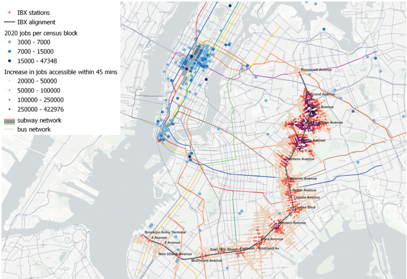
In terms of STRAVA cycling activity, we found that the IBX station areas fall within the lower 60% when compared to all NYC subway stations (Figures 4 & 5). Stations in Manhattan receive substantially higher levels of cycling activity, as expected given higher population and employment densities, a greater concentration of amenities, and a more extensive cycling network relative to the rest of the city. For this reason, we also evaluate IBX stations relative to other stations within Brooklyn and Queens, rather than only citywide rankings (Table 1).
Among IBX station areas, the highest average daily cycling activity recorded by STRAVA users occurs at Roosevelt Avenue Station, followed by Myrtle Avenue and 4th Avenue Stations. In contrast, the station areas of Linden, Livonia, Remsen and Utica Avenue Stations fall within the lowest 10 percent of all NYC station areas in terms of cycling activity. When compared only to Brooklyn and Queens station areas, Linden Avenue Station remains among the ten lowest-activity stations, whereas no IBX station falls within the bottom ten citywide in terms of STRAVA-recorded cycling activity. Low STRAVA ridership around IBX stations is expected, also because the demographics in these areas skew against the STRAVA users in terms of age, income and vehicle ownership (Figures 6 & 7).
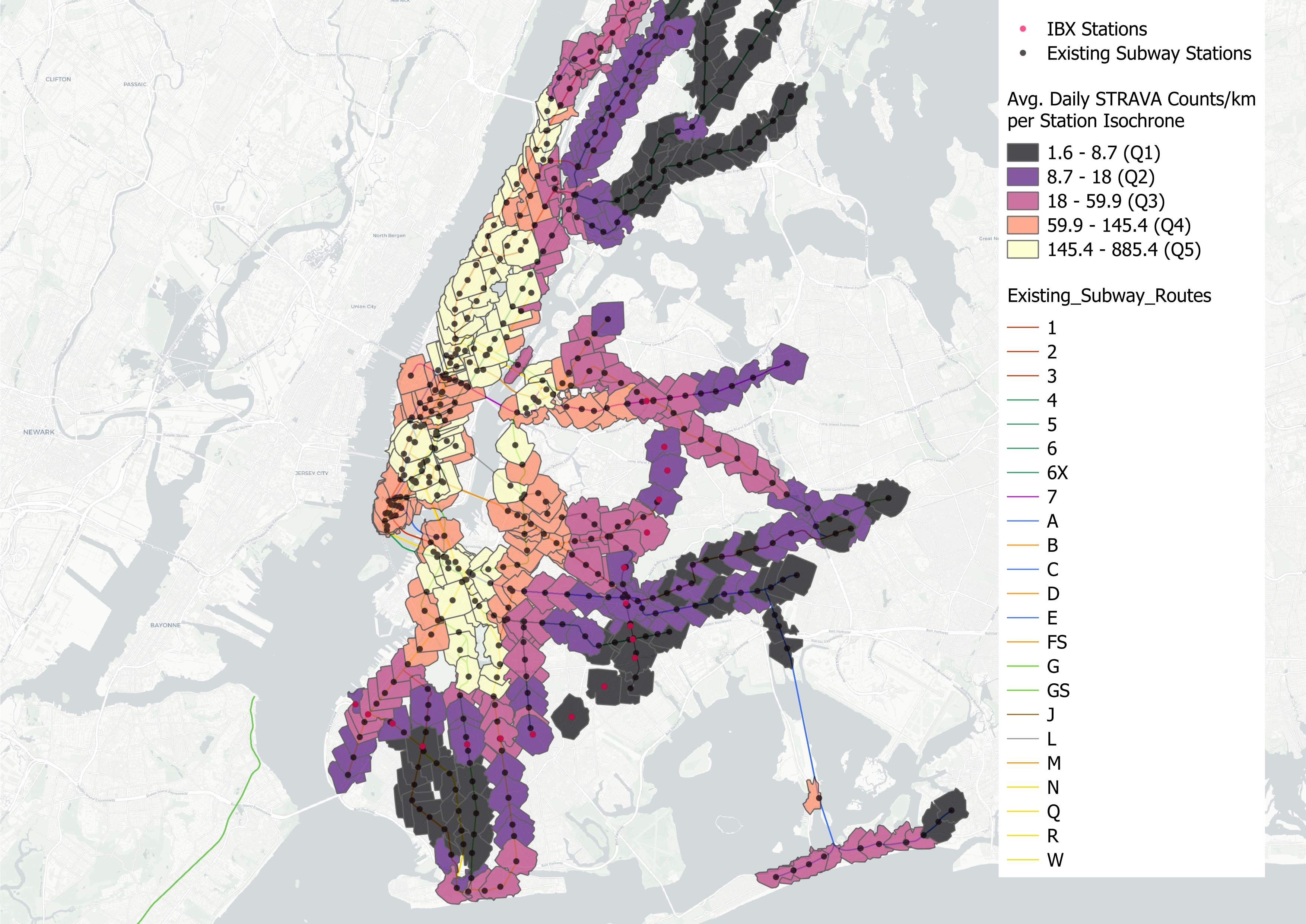
Figure 4: Daily STRAVA Cycling Trips Per Squre Kilometer by Isochrone
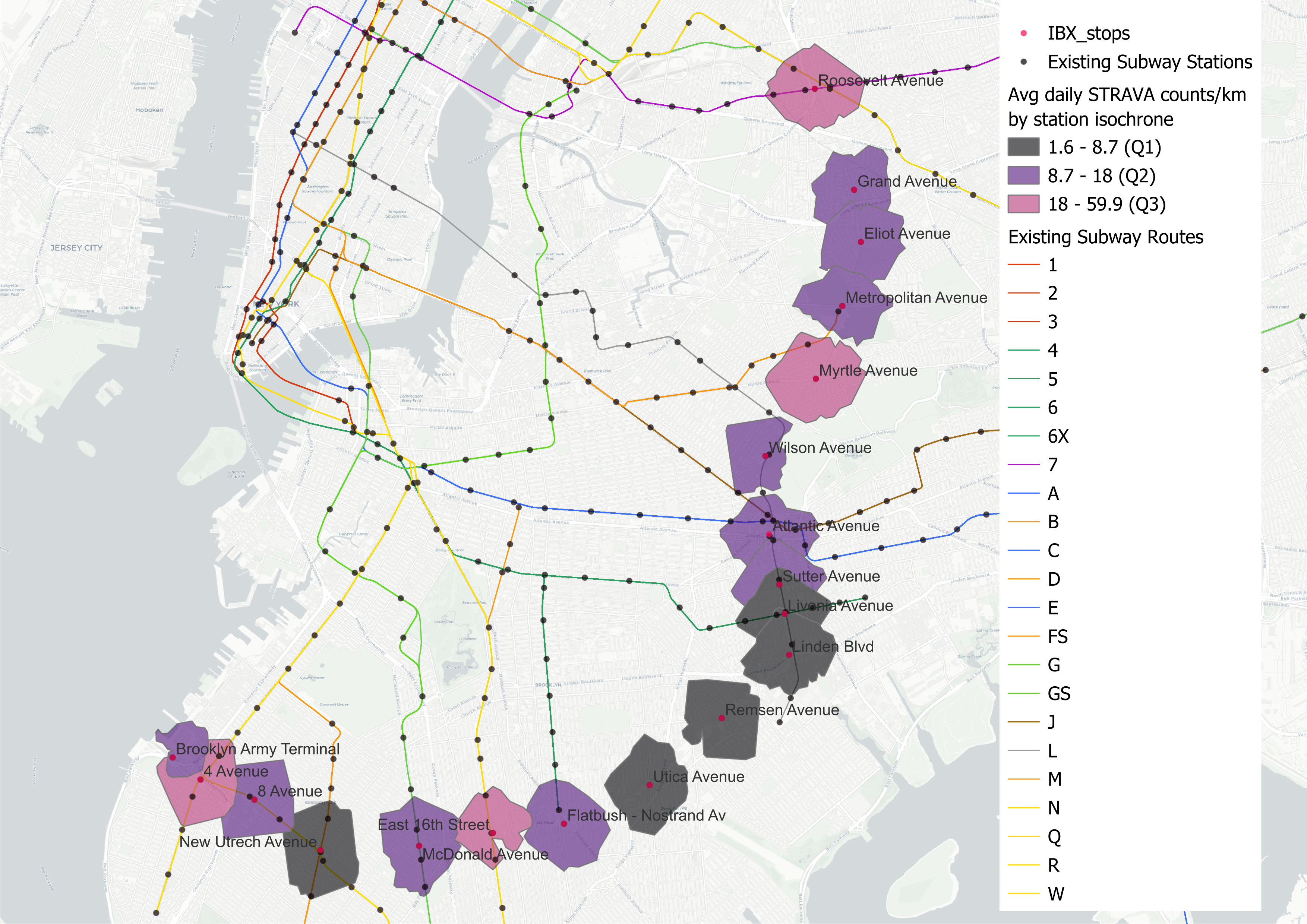
Figure 5: Daily STRAVA Cycling Trips Per Squre Kilometer by IBX Isochrone
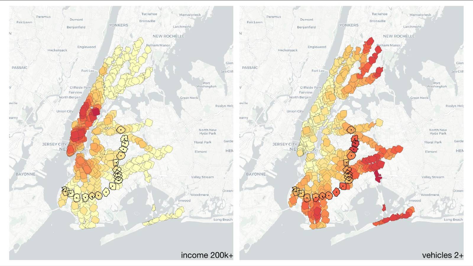
Figures 6-7: Households with a Yearly Income of $200k+ and Households Owning 2 or more Vehicles per Isochrone and IBX Isochrones
Table 1: Cycling Trip Averages and Ranks Across New York City and Brooklyn-Queens
| Station Name | Borough |
Avg Bike Count/ km2/day |
Avg Bike Count/km NYC rank (443) |
Avg Bike Count/km Bq-Qn rank (254) |
| Roosevelt Avenue | Bk | 34 | 228 | 107 |
| Grand Avenue | Bk | 13 | 304 | 162 |
| Eliot Avenue | Bk | 10 | 337 | 186 |
| Metropolitan Avenue | Bk | 12 | 320 | 172 |
| Myrtle Avenue | Bk | 32 | 231 | 109 |
| Wilson Avenue | Q | 16 | 277 | 149 |
| Atlantic Avenue | Q | 15 | 289 | 158 |
| Sutter Avenue | Q | 10 | 334 | 183 |
| Livonia Avenue | Q | 5 | 407 | 238 |
| Linden Avenue | Q | 4 | 420 | 247 |
| Remsen Avenue | Q | 5 | 414 | 244 |
| Utica Avenue | Q | 5 | 413 | 243 |
| Flatbush-Nostrand Av. | Q | 17 | 273 | 145 |
| East 16th Street | Q | 23 | 254 | 128 |
| McDonald Avenue | Q | 15 | 282 | 151 |
| New Utrecht Avenue | Q | 7 | 382 | 218 |
| 8th Avenue | Q | 10 | 343 | 190 |
| 4th Avenue | Q | 28 | 241 | 117 |
| Brooklyn Army Terminal | Q | 14 | 299 | 160 |
It is unsurprising that Roosevelt Avenue and 4th Avenue Station areas, both of which are among the three highest density IBX station areas, also record the highest cycling activity. These stations are well integrated into the city’s subway network and receive some of the highest daily subway trip volumes among IBX stations. The 4th Avenue Station directly intersects the 4th Avenue protected bike lane and lies close to the Shore Parkway Greenway, further supporting higher cycling activity. Myrtle Avenue Station’s proximity to the protected bike paths within Evergreens Cemetery, the dense shared-lane network of adjacent Bedford-Stuyvesant, and the neighborhood’s fine-grained, walkable street network likely explains the elevated cycling activity observed in this station area.
In contrast, the relatively low levels of cycling activity recorded around Livonia, Linden, Remsen, and Utica Avenue stations likely reflect a combination of factors, including limited bike lane availability, greater distance from the core cycling network, lower residential densities, and higher levels of private vehicle ownership.
Factors Affecting Cycling Intensity
To better contextualize the station-area patterns described above and inform the street-level analysis that follows, we examined how cycling activity relates to a range of demographic, travel, and built-environment characteristics. Specifically, we analyzed correlations between STRAVA cycling volumes and subway ridership; demographic indicators such as income and household size; travel characteristics including average commute times; and streetscape and network attributes such as sidewalk widths and street connectivity. Variables were aggregated at the subway-station isochrone level for all stations across New York City.
Cycling intensity around subway stations is highly uneven, with a small number of station areas functioning as citywide cycling hubs, while most station areas fall within a substantially lower range of activity. Across New York’s 424 existing stations, the median station area typical street-segment intensity is approximately 39 daily trips per kilometer, with a 90th percentile value of 223 and maximum of 885. This is consistent with a highly concentrated pattern of hotspot station areas where cycling activity is structurally supported and culturally embedded. This distribution implies that “cycling-to-transit” is not simply a question of adding end-of-trip facilities. In the highest-intensity places, cycling is already embedded in a broader system of street design, network connectivity, and land-use patterns. Cycling and station ridership co-locate, but not in a simple linear way. Cycling intensity tends to be higher in station areas with higher ridership (Spearman ρ=0.61), but the relationship is not straightforward. Around many subway stations where ridership is high, STRAVA cycling activity is low. Only when high subway ridership is complemented with cycling infrastructure, street-network connectivity and favorable streetscape characteristics such as wide sidewalks, do we see significant increases in STRAVA ridership.
If we ignore the socio-economic features, bike-route coverage, street network and streetscape conditions constitute the clearest and most actionable correlates for cycling intensity in station catchment areas. Within subway station catchment areas cycling intensity correlates most strongly with:
- Bike route coverage. Station areas with more extensive and higher-quality cycling infrastructure exhibit higher cycling intensity (Spearman ρ≈0.56-0.62).
- Streetscape and walkability conditions. Wider sidewalks and related qualitative streetscape measures are associated with higher cycling intensity (avg sidewalk width Spearman ρ≈0.59).
- Street-network connectivity and through-movement. Space Syntax measures (see Appendix) capturing movement potential and network connectivity show some of the strongest correlations with cycling intensity (intchoice Spearman ρ ≈ 0.66)
These built-environment relationships exist alongside strong socio-economic correlates, such as knowledge-sector employment, short to medium commute times, and lower auto-dependence. However, from a planning and implementation perspective, the bike infrastructure, streetscape quality and street-network represent the most directly actionable levers.
Cycling in the IBX Corridor
We began by examining simple pairwise relationships using Pearson and Spearman correlations. While useful as a first pass, these measures cannot capture the non-linear relationships and interactions that are common in urban systems. To address this, we also used a tree-based ensemble model that can learn more complex patterns in the data. We interpreted the model using SHAP (SHapley Additive exPlanations), which breaks each prediction down into the contribution of individual features, allowing us to see how different factors influence the outcome.
A SHAP summary plot (Fig. 8) was used to visualize feature importance while simultaneously indicating the direction and magnitude of each feature’s effect on the target variable across the full distribution of observations. We then compared the top and bottom ranked cycling intensity IBX station catchment areas, to the IBX and NYC medians, and plotted the interactions of the most important features in Fig. 9.
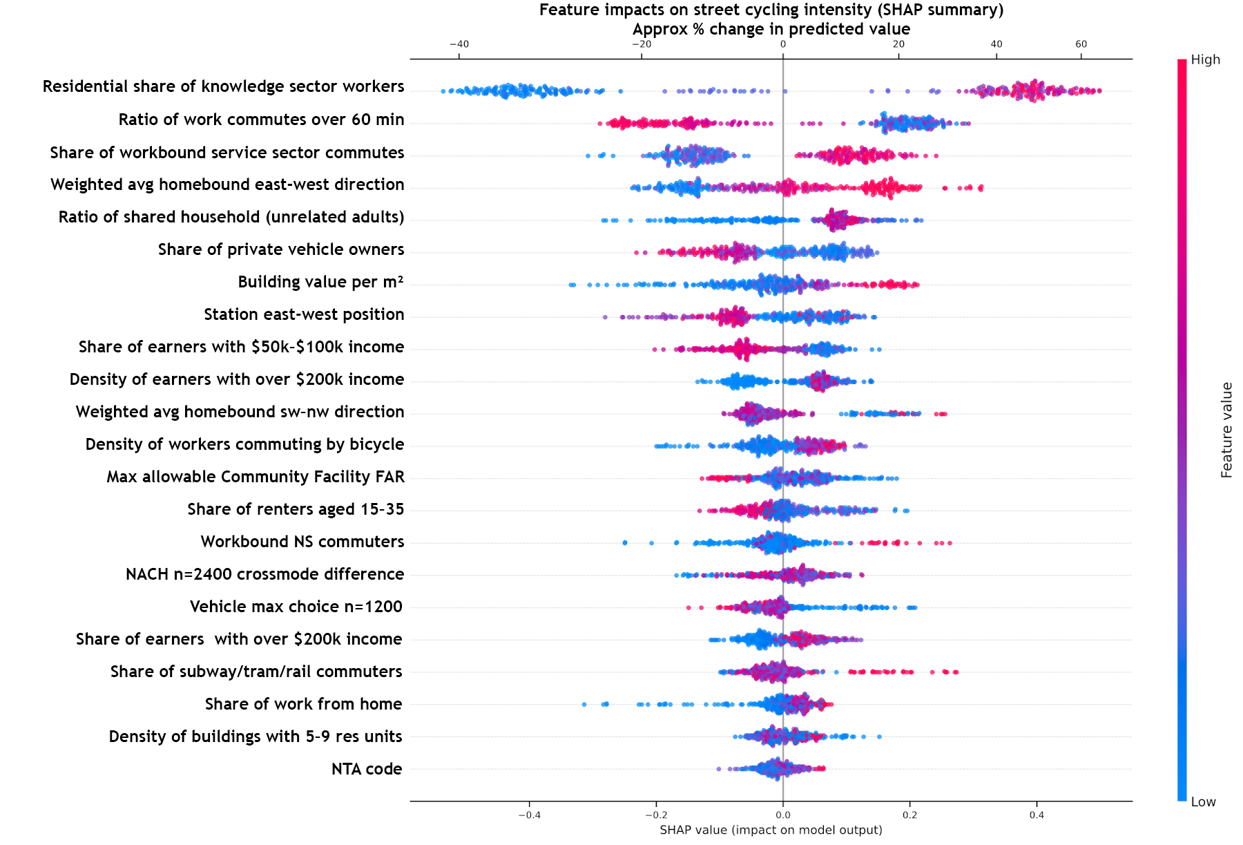
Figure 8: SHAP Summary Plot Showing Feature Importances
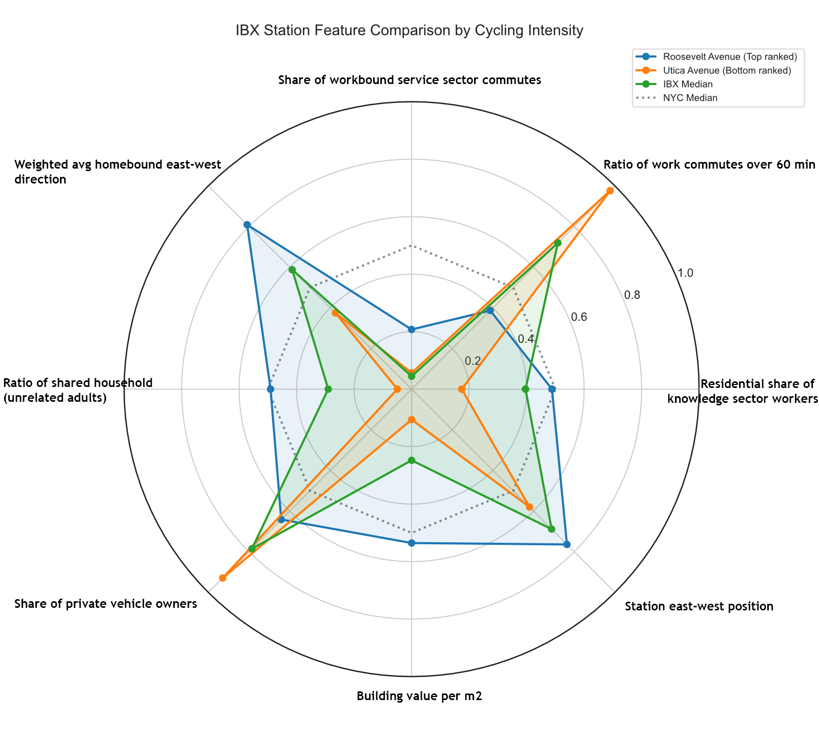
Figure 9: Interactions of the Most Important Features
Current (2024) cycling intensity in proposed IBX station areas is lower than the typical NYC subway station areas, but not uniformly low. Within the IBX, Roosevelt Avenue and Myrtle Avenue are close to the observed NYC median cycling intensity baseline, while 4th Avenue and East 16th Street sit in the upper range of IBX observed baselines, albeit well below the NYC median. As with the existing subway system more broadly, we do not expect cycling activity in the IBX corridor to scale linearly with station ridership in the absence of targeted on-street interventions.
Relative to the existing NYC station set, IBX station catchments show a distinct socio-economic and travel-structure profile, with implications for TOD and planning policy (Figures 6, 7 and 8). Compared with the 424 existing stations, IBX catchments currently show higher shares of very long commutes (60+ minutes), lower knowledge-sector employment share, and a more road-oriented travel structure. This points to a situation where IBX’s wider benefits are likely to be framed around accessibility gains and mode-shift potential, rather than simply intensifying existing cycling cultures. For cycling specifically, this supports a strategy that treats bike-to-transit as access design that includes street-network and safety programs, rather than as a post-hoc set of station amenities.
Consequently, we can classify IBX stations in three groups based on observed baseline cycling intensity:
- Group A: main baseline stations (approx. NYC median). These should be prioritized for early cycling improvements to take advantage of existing activity and distribute the flow within the corridor, and include Roosevelt Avenue and Myrtle Avenue. The focus here is on high-quality bike-to-transit integration, protected approaches, junction safety, and secure parking.
- Group B: mid-band baselines (NYC p25–median). These include 4th Avenue, East 16th Street, Brooklyn Army Terminal, Grand Avenue, Flatbush–Nostrand Av, Metropolitan Avenue, Atlantic Avenue, McDonald Avenue. The focus here should progress into barrier removal and cycle route network completion.
- Group C: (below NYC p25). Additional attention needs to be given to IBX stations where we currently expect high ridership but low cycling intensity, such as Eliot, Wilson, Sutter, Livonia, Linden, Remsen, Utica, New Utrecht and 8th Avenue Stations, as these represent missed opportunities and a disconnect between active transportation in the street public realm and the transit network. The implication here is that cycling to and within the IBX will depend on creating safe east–west connections and continuous approach routes, not simply adding end-of-trip facilities at stations.
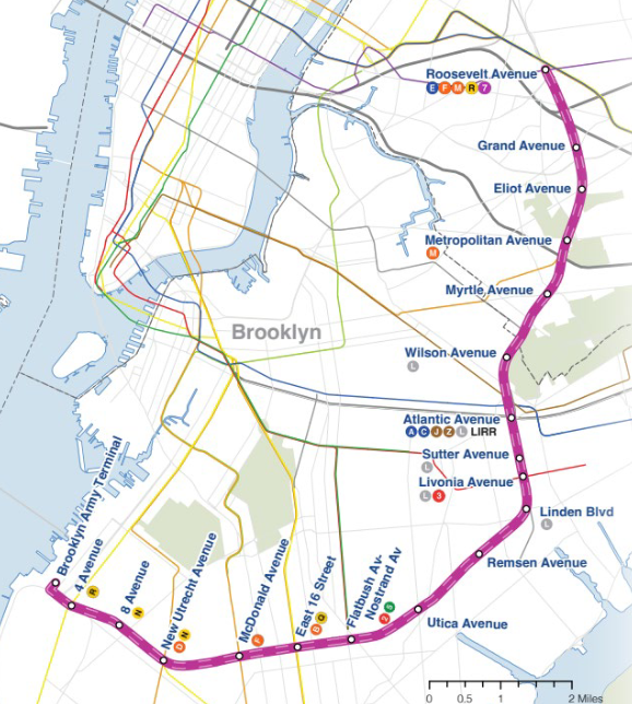
Street-Level Ridership
Figure 11 presents cycling activity aggregated at the street-segment level across New York City with a focus on the IBX corridor. Class I and II bike lanes, as of 2024, representing protected and conventional (painted) bike lanes are shown in thick green and blue lines, respectively, while STRAVA cycling activity is shown in dark purple, purple and magenta, representing high-to-low average daily counts ranging between 2,000 and 10 trips.
Our first observation is that the highest levels of cycling activity are concentrated in Manhattan and gradually decline toward the outer boroughs, largely mirroring the distribution of cycling infrastructure. Outside Manhattan, the most heavily used corridors include the Brooklyn Greenway and adjacent dense neighborhoods such as Greenpoint, Williamsburg, Brooklyn Heights, and Boerum Hill, likely due to bridge connections that have increasingly incorporated bike lanes over the past several decades.
Second, some of the highest cycling volumes occur within parks and parkways, including Prospect Park, Forest Park, and Ocean Parkway, all of which feature protected bike lanes physically separated from traffic or, in the case of Prospect Park, full roadway closures to motor vehicles (see Figure 10 for the existing Brooklyn Greenway and planned expansions). This pattern is also consistent with STRAVA’s tendency to capture a higher share of recreational cycling trips.
Third, cyclists overwhelmingly use bike lanes where they are available and rely on streets without infrastructure primarily when nearby alternatives do not exist.
Finally, several routes without dedicated infrastructure function as continuations of existing bike lanes and are used despite the lack of protection, particularly when they connect directly to other segments of the network or to major parks and greenways.
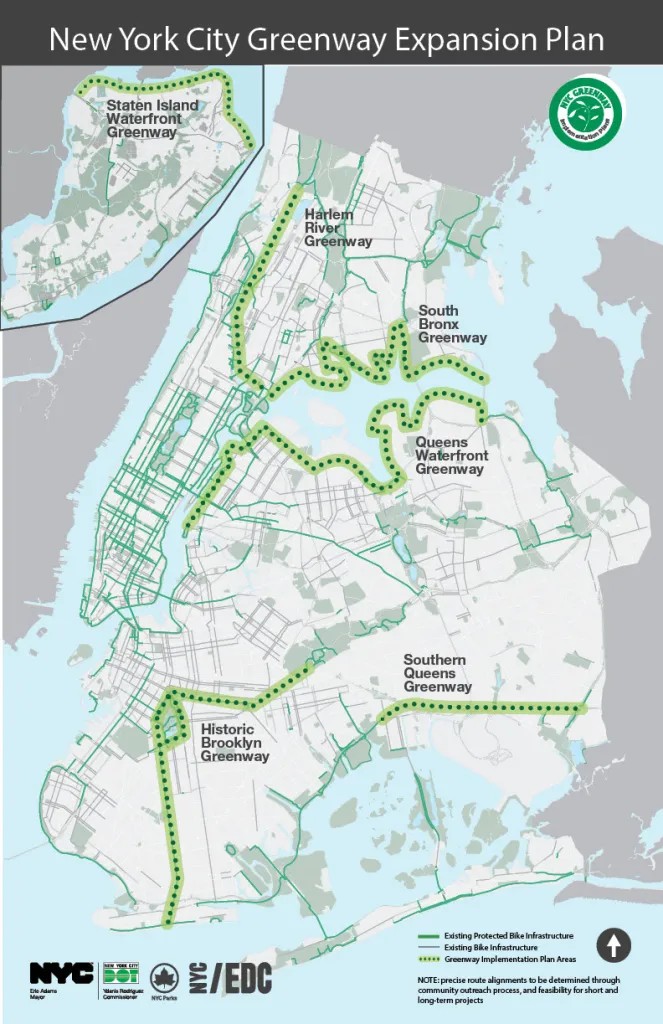
Figure 10: Greenway Expansion Plan from https://www.brooklyngreenway.org/
Most of IBX’s station areas remain distant from the city’s core cycling network and the greenways, with the exception of the southern terminal station at Brooklyn Army Terminal, which directly intersects the Brooklyn Waterfront Greenway and McDonald Avenue, which is only a few block away from the Ocean Parkway. Nevertheless, despite limited protected infrastructure and only a small number of conventional lanes extending eastward from dense neighborhoods such as Bushwick and Bedford-Stuyvesant, we observe substantial cycling activity along several routes that connect Manhattan and central Brooklyn to peripheral greenways and parks.
The 4th Avenue Station isochrone, adjacent to the Brooklyn Army Terminal isochrone, connects the 4th Avenue protected bike lane to the Brooklyn Greenway, while the Queens Boulevard protected bike lane passing through the Roosevelt Avenue Station isochrone provides a similar connection to the Central Queens Greenway. Accordingly, Roosevelt Avenue and 4th Avenue stations record the highest and third-highest cycling activity per kilometer of street segment among all IBX stations. Notably, Myrtle Avenue Station, despite lacking continuous protected infrastructure aside from a short segment along Cypress Hills Street, records the second-highest cycling activity per kilometer, driven largely by cycling along Myrtle Avenue itself and along the Fresh Pond Road–Cypress Hills Street–Central Avenue corridor, which connects the city’s central cycling network to the Evergreens Cemetery paths and the Queens Boulevard protected lanes.
Beyond these corridors, we also observe elevated cycling activity along Roosevelt, Grand, Eliot, Metropolitan, Pitkin, and Bedford Avenues. The first three directly intersect proposed IBX stations, while the latter corridors lie within one mile of multiple IBX stations. These routes appear to attract cyclists despite limited protection, likely due to a combination of their role as major arterials serving dense residential and employment areas and the connectivity they provide to recreational destinations and the broader cycling network.
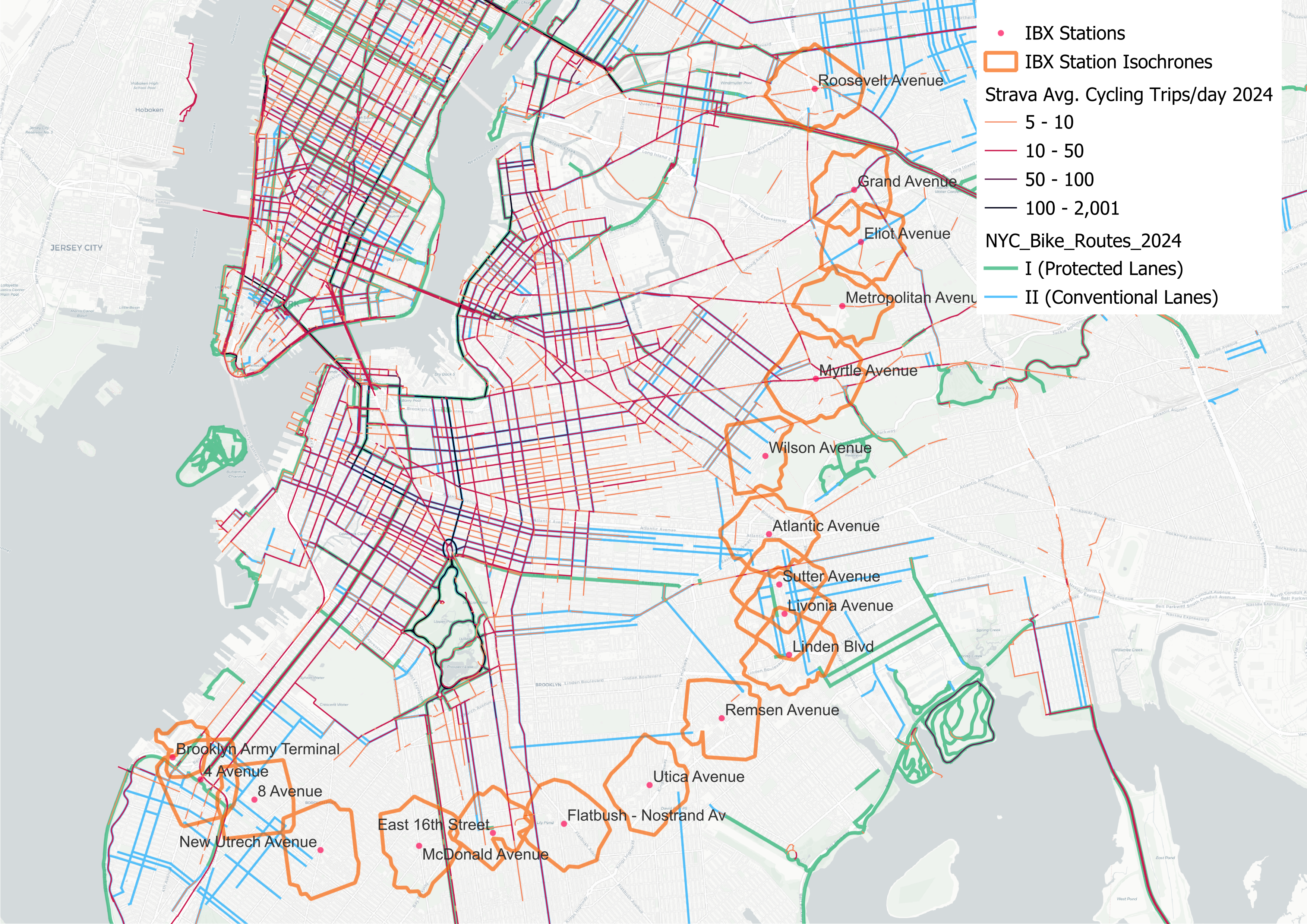
Figure 11: Street-Segment-Level STRAVA Ridership
Cycling Infrastructure Potential Along the Corridor
New Bike Lanes
In cities where cycling mode share is low and private vehicle use is high, cyclists depend heavily on dedicated infrastructure to ride safely, making the presence of cycling infrastructure a primary determinant of route choice. As illustrated in our maps, New York City is no exception: cycling activity is highest where bike lanes exist, and especially where protected lanes are present.
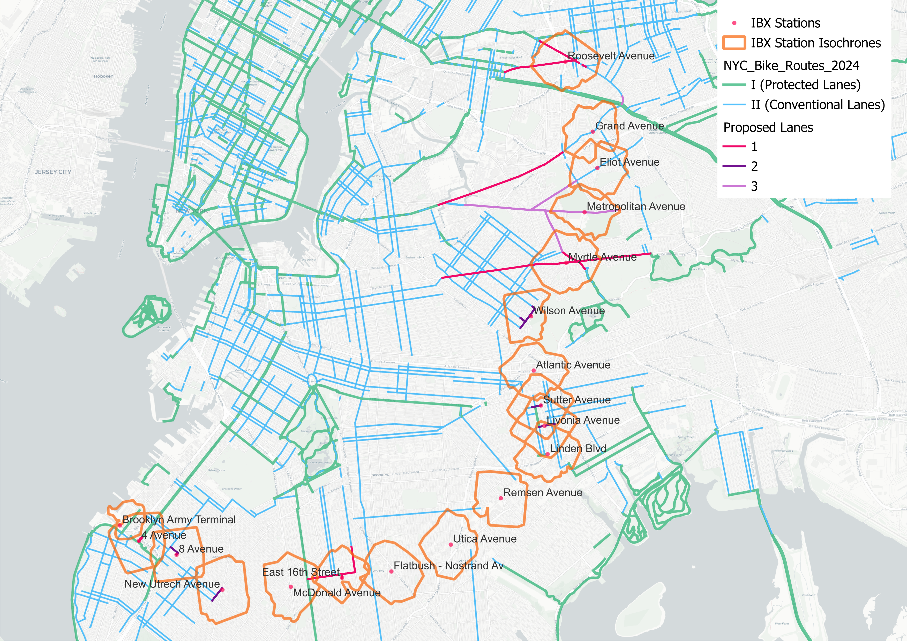
Figure 12: Proposed Bike Lanes and Tiers
The greatest opportunity for expanding the cycling network along the IBX corridor lies in routes that already exhibit significant STRAVA ridership, extend outward from the existing network, and either close critical gaps or connect to parks with bike facilities, while also improving access to proposed IBX stations. These priority routes are shown in pink (1) in Figure 12. Secondary proposals, shown in dark purple, consist of short network extensions designed specifically to connect existing infrastructure to IBX stations. Third-tier proposals include longer corridors that also demonstrate existing ridership but would require larger capital investments.
Our first-tier proposals include:
1- Extending the protected bike lane on Broadway to Diversity Plaza by upgrading existing shared lanes and constructing new protected segments.
2- Installing a bike lane along Roosevelt Boulevard from Vincent Daniels Square to the existing 74th Street–Broadway stop on the 7 subway line.
3- Adding a bike lane along Grand Avenue between Metropolitan Avenue and 69th Street.
4- Upgrading and extending bike infrastructure along Myrtle Avenue between Willoughby Avenue and Forest Park Drive.
5- Installing a bike lane along Avenue H between Ocean Parkway and Ocean Avenue, with a direct connection to the proposed IBX station.
6- Closing the short gap in the 4th Avenue protected bike lane between 64th and 66th Streets.
Secondary proposals include:
1- Connections between the existing network and the 8th Avenue, New Utrecht Avenue, Livonia Avenue, Sutter Avenue and Wilson Avenue Stations.
Our third level proposals include:
1- A bike lane along Metropolitan Avenue between Scott Avenue and 74th Street.
2- A lane along Eliot Avenue between Metropolitan Avenue and 69th Street.
Ideally, this expansion would prioritize upgrading existing conventional lanes to protected facilities and constructing new protected lanes along corridors without any current infrastructure. However, recognizing budget constraints, wider arteries such as the Roosevelt Boulevard, Grand Avenue, Myrtle Avenue, Avenue H and 14th Avenue can be prioritized for protected lanes, while conventional lanes may be appropriate for shorter and narrower connector routes.
We do not propose additional cycling infrastructure connecting to the Atlantic Avenue Station, as this station already lies along Eastern Parkway, which is included in the New York City Greenway Expansion Plan (Figure 10) and would naturally enhance access to IBX stations as well as the broader cycling network.
Citibike Infrastructure
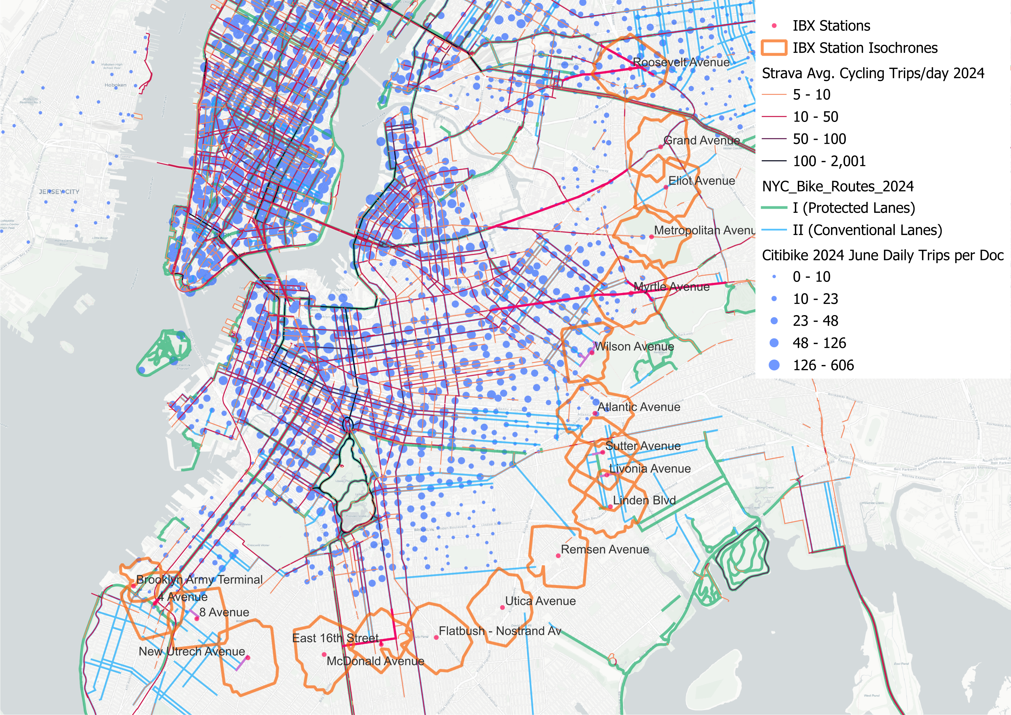
Figure 13: Avg. Daily Trips Originating from Citibike Docs in June 2024
We also examined the spatial distribution of Citi Bike stations across New York City and the average daily ridership originating from each station in June 2024. Both station locations and ridership patterns closely mirror those observed in STRAVA cycling activity, with the highest concentrations in dense neighborhoods and along the city’s core cycling infrastructure.
As the City seeks to expand the cycling network and increase ridership, extending Citi Bike coverage toward the outer boroughs and peripheral neighborhoods should be a complementary strategy. The proposed IBX is expected to catalyze new development and travel demand around its stations, presenting a timely opportunity to expand bike-share service in parallel with new transit investment.
One potential strategy is to prioritize expansion around IBX stations that already have strong subway access and/or relatively high levels of observed cycling activity, as well as their adjacent station areas, including Roosevelt Avenue; the Brooklyn Army Terminal–4th Avenue–8th Avenue corridor; and the Myrtle Avenue–Metropolitan Avenue. Expanding Citi Bike in these locations would build on existing travel patterns while strengthening first- and last-mile connections to the IBX.
A second strategy is to target station areas that function as transit deserts, consistent with findings from our previous research, and use bike-share to improve access to IBX stations in these underserved locations. Eliot Avenue, Metropolitan Avenue, and Myrtle Avenue stations, as well as 8th Avenue, New Utrecht Avenue, Utica Avenue, and Remsen Avenue stations, are particularly well suited to this approach, as bike-share could provide a low-cost, flexible access option in areas with limited existing transit connectivity.
Conclusion
In this report, we present an analysis of cycling behavior recorded by STRAVA users in New York City, with a particular focus on opportunities for infrastructure improvements along the proposed IBX light-rail corridor. We acknowledge that the city’s cycling network would benefit from upgrades and expansions beyond the geographic scope of this study. However, examining the IBX corridor’s relationship to the existing and planned cycling network, including the city’s greenways, is especially valuable, both because new rail infrastructure and associated development can expand cycling demand, and because improved cycling access can increase IBX ridership by expanding station catchment areas.
We also recognize that STRAVA data does not represent all cyclists and disproportionately reflect male, young to middle aged, tech-savvy, recreational and higher-income riders. Nevertheless, STRAVA provides uniquely detailed street-level activity data, making it more spatially comprehensive than sources such as Census commute mode share data or DOT bicycle counts, which are limited to specific counter locations. This granularity allows for comparative analysis of cycling activity across all street segments in the city, even if the data represent only a subset of cyclists. Importantly, it also highlights corridors with substantial use despite limited or missing infrastructure, indicating clear opportunities for targeted investment.
Finally, while expanding and improving New York City’s cycling network would enhance safety, increase cycling activity, and potentially reduce vehicle miles traveled, we do not recommend funding these improvements through the IBX construction budget. Previous cost studies suggest that project betterments, including bike lanes, can introduce delays and cost pressures. Accordingly, we recommend that these proposals be evaluated and advanced as part of the city’s broader cycling network expansion program.
Appendix: Methodology
STRAVA Data Standardization and Center-line Generation
Strava activity data utilizes OpenStreetMap (OSM) basemaps that differ according to the data year. These basemaps appear to undergo minimal pre-processing by Strava, primarily involving the splitting of lines at intersections to create a network based on routing decision points. Consequently, all OSM edges, including non-standard tags and sidewalk edges, are often incorporated, presumably to enhance network completeness. In New York City, this results in inconsistencies: some streets feature multiple parallel edges and sidewalks — each potentially receiving distinct Strava counts presumably attributed to the nearest feature — while others are represented by a single centerline. This lack of standardization can skew analytical results and hinder the calculation of various metrics. Our primary objective, therefore, was to develop a unified centerline network that accurately reflects aggregated Strava counts.
The process begins by ingesting Strava activity data and OSM road network data from the corresponding basemap year. Both datasets are reprojected and standardized to New York City’s metric projection (EPSG:6538). A join operation on osm_id integrates essential OSM attributes. Initial exploratory data analysis informs our understanding of trip count distributions across different road types, leading to the exclusion of ‘crossing’ footways and the establishment of attribute-specific length thresholds for subsequent processing steps.
An important part of our aggregation methodology is the generation of a unified street centerline representation. This centerline incorporates aggregated Strava counts for “logical streets,” defined as street segments between intersections, which, consistent with Strava’s approach, are considered decision points. Each logical street segment is thus represented by a single centerline. The transformation involves standard geometric and data cleaning pre-processing. Topology simplification is performed by merging nearly collinear segments based on angular deviation. Street zones (corridors) are generated from vehicular centerlines to identify and associate relevant sidewalk segments. For extensive variables (e.g., trip counts), segments forming the same logical edge are merged using the maximum attribute value, while counts from distinct parallel edges within the street zone are summed onto the primary vehicular centerline. Intensive variables (e.g., average speed) are aggregated using a length-weighted average to mitigate the influence of very short segments. Finally, any remaining non-vehicular network elements, not associated with vehicular streets, are incorporated into the dataset. A visual inspection of the results shows how sidewalk inclusion in the original dataset overpowers and skews interpretation. We expect this to propagate downstream during data analysis if not handled with care. A simplified centerline aggregation minimises both these issues.
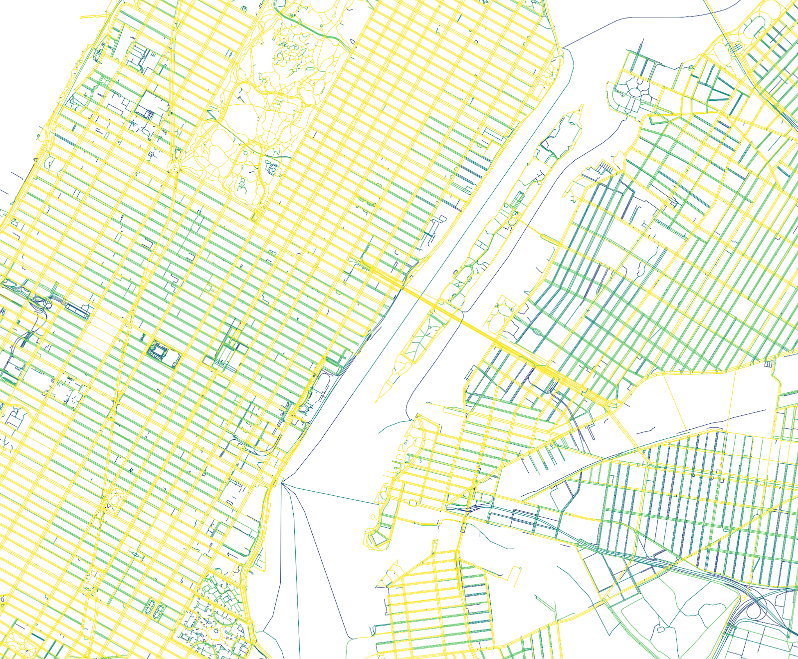
Figure A1: Trips per OSM Segment as Provided by STRAVA
Figure A2: STRAVA Trips Aggregated by Center-lines
STRAVA data aggregation at Isochrone Level
STRAVA data, aggregated at source to individual OpenStreetMap edges within logical streets, is used as a proxy for cycling activity. After calculating the length of each centerline, a spatial join with intersect operations was performed with 10-minute walking distance isochrones for each New York City subway station and the proposed IBX line stations, resulting in an aggregated geodataset including maximum, mean, median, sum, and count values (these last two specifically employed for subsequent density measurements). We then divided the sum of trip counts by surface area as well by total centerline length of each isochrone. This gave us a per-square-kilometer and per-meter intensities of cycling activity for all isochrones.
Analysis proceeded through both visual and statistical methods to compare cycling intensities with demographic and built environment data per isochrone. Choropleth mapping was used to identify spatial patterns of activity, while statistical analysis explored correlations and other relationships within the data.
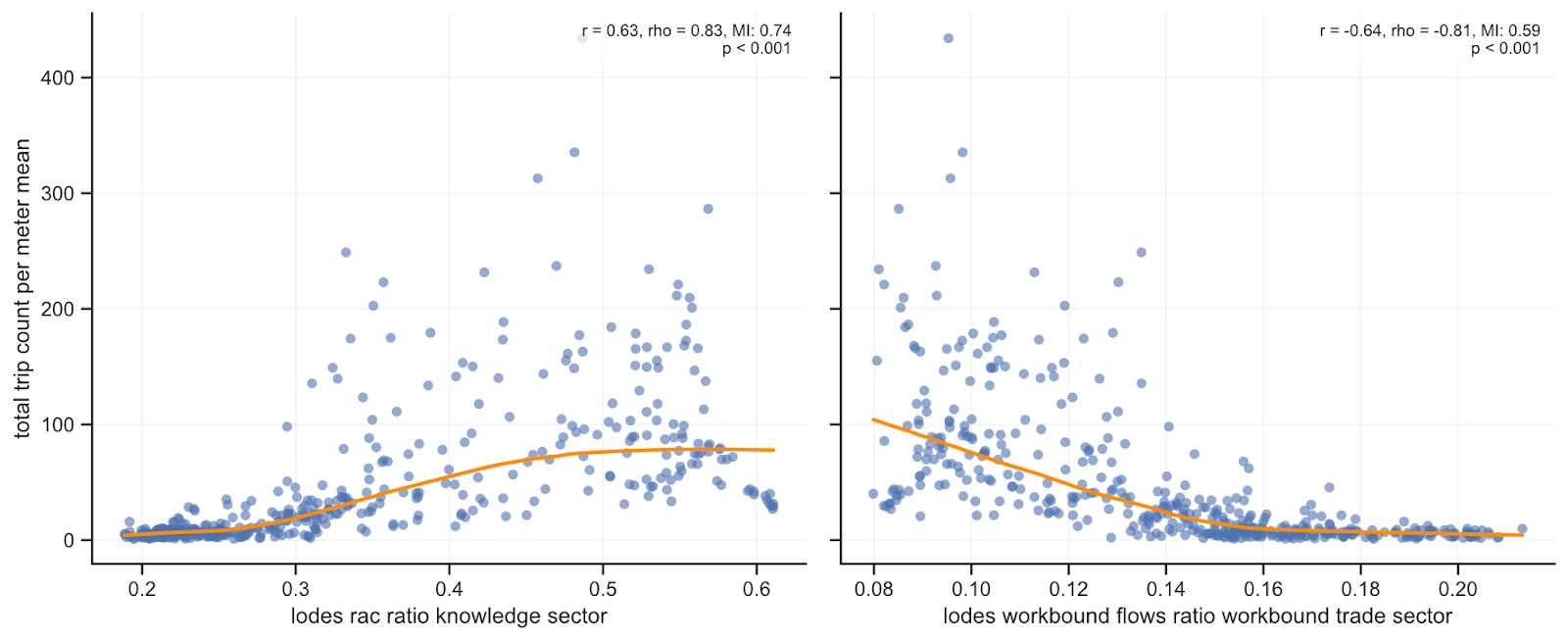
Figures A3-A4: STRAVA Avg. Trip Counts per Meter vs. Share of Knowledge Sector and Trade Sector Workers within Residents of Isochrone
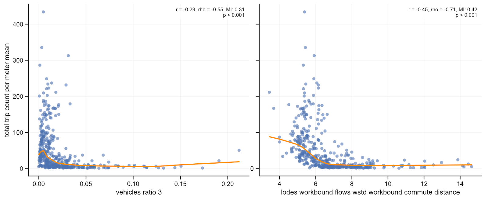
Figures A5-A6: STRAVA Avg. Trip Count per Meter vs. Ratio of Households Owning 3 or More Vehicles and Average Commute Distance in Miles
Space Syntax
Recognising that cities function as complex systems, we apply network analysis on the NYC subway network, and Space Syntax on the NYC street network. Space Syntax is a methodology initially developed at UCL by Hillier & Hanson for analyzing how street networks function as connected systems, and how their structure influences movement and accessibility. At its core it relies on two principal measures: Integration, which captures how close a street segment is to all others in the network, and is commonly associated with destination intensity (i.e. how likely a street segment will function as a destination), and Choice, which measures how often a segment lies on the shortest paths between all other segments (i.e. how likely a street segment will be passed through), and is widely found to correlate with movement flows and trade location. Two indicators show up as main features explaining the cycling intensity model: Choice and NACH cross-mode difference. The latter is based on normalized choice, and captures the difference between pedestrian and vehicular street network representations, highlighting locations where the network structure privileges one mode of travel over the other.