
Roosevelt Boulevard Subway Corridor Analysis and Ridership Estimates
Authors: Elif Ensari Sucuoglu, Joao Paulouro and Eric Goldwyn, Published in: July, 2025
Authors’ note: Although the Roosevelt Boulevard Subway (RBS) proposal is unrelated to New York’s IBX corridor, we include it here due to its relevance in testing our ridership estimation methods. The RBS study was completed as part of an earlier collaboration with a Philadelphia-based advocacy group. While our engagement with the project has concluded, the analysis provides useful context for understanding corridor-scale transit proposals and their evaluation.
The Roosevelt Boulevard Subway (RBS), like New York’s Second Avenue Subway or Boston’s Green Line Extension, is a project that has been proposed, drawn on maps, and abandoned for more than a century. The first leg of Roosevelt Boulevard, the roadway, opened to traffic in 1914, initially known as Northeast Boulevard, and grew in stages through the 1950s and 1960s. The 300-foot-wide, 12-lane, at times undulating, Roosevelt Boulevard has proven itself to be a vital, congested corridor connecting more than 20 neighborhoods, including substantial minority and low-income populations, and passing within one mile of a third of the city’s population. The boulevard is teeming with activity: every day, 90,000 vehicles travel its 12 lanes, 28 bus routes shuttle more than 25,000 riders along or across the boulevard serving 147 stops, and more than 3,000 pedestrians use its busiest intersections. All of this activity and mix of users along the boulevard comes at a cost: in addition to the obvious environmental impacts, buses travel at half the speed of cars and there is more than a crash per day on the boulevard, which has earned it the unfortunate nickname, “the corridor of death.”
Because Roosevelt Boulevard looms so large in Philadelphia and is so obviously chaotic, the City of Philadelphia, South Eastern Pennsylvania Transportation Authority (SEPTA), Pennsylvania Department of Transportation (PennDOT), Delaware Valley Regional Planning Commission (DVRPC), elected officials, and advocates agree that re-imagining the boulevard is central to Philadelphia’s future. What that re-imagining includes, however, is unresolved. In order to help guide decision making, we have generated ridership projections for a new 14-mile, 12-station RBS build out that will tie into the existing Broad Street Line (BSL) and include an extension of the Market Frankford Line (MFL) using a machine learning (ML) model. We decided to develop ML estimates to test how well it predicts ridership relative to traditional methods. Based on our ML results and the traditional ridership estimates produced by PennDOT, which also include a cost estimate, we argue that building the RBS within a firm, cost-effective budget envelope to at least Rhawn, so not the 14-mile proposal analyzed below and discussed by others, with a one-mile extension of the existing MFL, will bring order to Roosevelt Boulevard, by providing a fast, dedicated right-of-way for transit riders, and improve travel times to and from Center City for Philadelphians–in some cases cutting trip times by as much as 40%–facilitate development, attract new residents and businesses, and stimulate economic activity along the corridor.

Figure 1: Proposed 18-mile, 14-station RBS route and MFL extension
Below, we describe the existing conditions along Roosevelt Boulevard, with the express goal of developing ridership estimates for the full 18-mile Boulevard Subway including the existing section from City Hall to Erie, with 12 new and 2 existing stations. By highlighting how tens of thousands of Philadelphians will benefit from the Boulevard Subway, we can understand ridership benefits and think creatively about what the future RBS should look like.
Analysis
We develop our analysis across five broad areas that directly feed transit ridership estimation: population density, jobs, land use, vehicle ownership, and transit connectivity. For our analysis, we examine each of these indicators within the boundaries that define a 10-minute walking distance from proposed RBS stations, defined as 10-minute isochrones around stations. While traditional impact studies often rely on a blunter mile or half-mile buffer of a proposed right of way—frequently overestimating areas by including inaccessible spaces—we instead focus on finer-grained walksheds to better understand station dynamics and how they differ along the corridor.
In the following sections we compare our indicators for the proposed RBS station isochrones with the same 10-minute isochrones for the Broad Street Line (BSL), Market-Frankford Line (MFL) and Norristown High Speed Line (NHSL) station areas. We also present ridership predictions made using a custom ML pipeline we developed.
Population Density
Population density is intuitively and empirically proven to be a key predictor of non-automobile travel because without people there are no transit riders (Cervero and Kockelman 1997; Taylor et al. 2009). Many of the proposed station locations along the RBS right of way already have transit-supportive densities. The City Hall, Pratt, Rising Sun, and Bustleton stations, for example have average residential densities as high as 27,000 – 29,000 people per square mile (Fig. 2), levels that Renne and Ewing (2013) associate with transit mode shares of 40% or higher (2013). The 9th Street, Erie, Cottman, Welsh-Grant and Rhawn stations follow with population densities that fall between 10,000 to 22,740 per square mile, which support transit mode shares of at least 14% (Renne and Ewing, 2013). Notably, according to the Federal Transit Administration’s New Starts and Small Starts Project Evaluation framework (FTA, 2013), station areas with densities above 15,000 persons per square mile receive the highest rating of ‘5’, and half of the proposed RBS stations exceed this threshold.
While these initial comparisons are helpful, many astute observers have noted that “density is not destiny” when it comes to transit ridership (Mees 2009; Boisjoly et al. 2018; English 2025). The reach and integration of the transit network, as well as the quality and frequency of service also determines ridership. Thus, it is not surprising that even though several station areas do have high residential densities, densities that suggest that transit could compete for nearly half of all commuting trips, due to station areas’ low transit connectivity[1] without the RBS, only one of the newly proposed station areas achieves a transit mode share greater than 30%. This means that because taking transit is inconvenient due to low levels of service, aside from the existing City Hall and Erie stations and the newly proposed 9th Street station area, more than 50% of commuters around the proposed stations drive to work. With the introduction of faster, more reliable subway service than the existing bus, we anticipate that transit will compete for a larger share of commute trips and inch closer to the 40% or higher found in the literature.
As fertile as the most central stations are for greater transit ridership, the northernmost stations, Neshaminy, Old Lincoln, and Southampton, have the highest driving mode shares of 74%, 74%, and 68%, respectively. Reversing these proportions will be more challenging without also thinking carefully about land-use, station locations, station access, and service (i.e. timed transfers, increased frequency, etc). The rapid decline in residential density around stations as we go farther north and out of the city center, is partly due to the large industrial and commercial facilities that surround the corridor. The Red Lion, Old Lincoln, Southampton and Neshaminy stations have very low population densities, ranging from 164 to 4,700 residents per square mile, which on their own, would not support a robust rider base. However, the city already envisions developing medium density mixed-use transit centers and new residential neighborhoods adjacent to the corridor by 2040, as outlined in the Route for Change plan (pp.234-249). These changes should lead to population and jobs growth in these neighborhoods, which will positively impact transit ridership, although we still recommend building RBS to Rhawn rather than extending out to Neshaminy in order to maximize cost effectiveness.
Figure 2: Population/Square Mile
Jobs
Job density, like population density, is a key determinant of transit ridership (Thompson et al. 2012; Ibraeva et al. 2020). Employment densities around most newly-proposed RBS stations fall below the 20-50 jobs per acre range typically considered transit-friendly (Frank and Pivo 1994); the stations with the highest employment densities aside from City Hall are Neshaminy, Old Lincoln, and Erie, with 12, 15, and 23 jobs per acre, respectively. In contrast, the BSL and MFL stations near 13th Street, 15th Street, Walnut-Locust, and Center City, including City Hall proposed as the terminal station of the RBS, have employment densities exceeding 300 jobs per acre (Fig. 3). This highlights the significant potential for a through-running RBS to connect with the BSL at Erie Station, offering direct, single-seat access to 522,465 jobs in under 30 minutes. Building on the existing employment density in Center City, the RBS is likely to boost property values, attract investment and increase the number of businesses along the corridor, which in turn, can be expected to create more jobs in the area.
Figure 3: Jobs/Acre
Land Use
Land use decisions guide where jobs and households are ultimately located in a metropolitan area. Zoning and other regulations, like building codes, determine how intensively land can be developed, which establishes limits to population and jobs densities (Chakraborty and Mishra 2013; Bertaud 2018; Bronin 2024). The proposed RBS station areas north of Rhawn are mostly commercial or industrial with low densities, big-box stores and shopping malls surrounded by large, forbidding parking lots. The southernmost station areas, on the other hand, are predominantly residential, with relatively higher densities, better connected street grids, and more pedestrian-friendly streets (Fig. 4). Neither of these development patterns, however, are compact, mixed-use walkable built environments that are essential enablers of transit use. In the “Route for Change” plan, the city proposes changes along the corridor to create “Walkable Station Areas” (WSAs) that have moderate to high residential densities, compact and mixed-use developments within a 5- to 10-minute walking distance from stations as well as much denser street grids (Figs. 5-8).
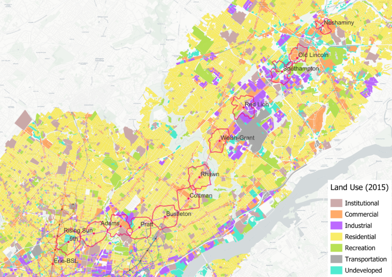
Figure 4. Existing Land Use
Based on our analysis of the 10-minute pedestrian isochrones, we find that the street-network has relatively limited coverage and poor connectivity. This is most prevalent in the northernmost station areas that include expansive industrial parks, big box commercial facilities, and large surface-level parking that significantly hinder walkability and access. Moreover, the corridor itself acts as a barrier between its two sides, due to some geometric characteristics like its 12-lane width, diagonal intersections and crossovers between local and express lanes.
While building the new RBS stations would be the perfect opportunity to redesign the sidewalks and connections along the corridor, the land-use changes envisioned to densify and diversify the corridor also require the subdivision of several lots, allowing for a re-configuration of the street-network and increase in network connectivity. All of these changes would significantly increase walkability along the corridor, especially in the northernmost RBS station areas currently exhibiting the lowest levels of pedestrian accessibility. This improvement will reduce walking trip times to stations, which in turn will boost ridership.

Figure 5: Adams Ave. (“Tower Center”) WSA, source: Roosevelt Boulevard Route for Change Program

Figure 6: Grant Avenue-Welsh Road WSA, source: Roosevelt Boulevard Route for Change Program

Figure 7:Red Lion WSA, source: Roosevelt Boulevard Route for Change Program

Figure 8: Neshaminy Mall WSA, source: Roosevelt Boulevard Route for Change Program
Vehicle Ownership
Figure 9: Vehicle ownership
Building RBS and supporting transit-oriented development along the corridor will offer an alternative to car-dependency for a larger population than the 114,000 residents currently living within a 10-minute walk of the stations.[2] First, the proposed land use changes, if enacted, will enable more residents to move into and near these 10-minute walksheds because of RBS’s higher carrying capacity. Second, the improved street network will expand the usable physical area included in the 10-minute walksheds by providing greater connectivity to areas that were previously excluded due to barriers like large lots and surface parking.
Current vehicle ownership trends along the boulevard parallel some of the demographic characteristics, and along the majority of the corridor, the proportion of households with zero cars remains below 20% (Fig. 9). Around the southern section of the line, the majority of residents identify as Black or Hispanic and earn lower incomes relative to the rest of the region. Households around these areas are also less likely to own cars. We see this clearly when we examine the wealthier and predominantly white station areas, namely Neshaminy, Old Lincoln, Southampton, and Red Lion, where only 0-1.6% of households have zero cars. Unsurprisingly, these proportions increase to 31%, 37%, and 47% around the 9th Street, Erie, and City Hall station areas, respectively. Adams Street has the next highest share of zero-vehicle households at just 12%, highlighting the car-dependence of most other station areas along the corridor.
Commuting patterns are in line with the vehicle ownership trends along the corridor. Public transit use among residents living within 10-minute isochrones falls steadily in the northern stations whereas the 9th Street and Erie station areas are in census tracts where close to half of all commuting occurs via public transportation (Figs. 10 and 11).
Transit Connectivity
The availability and quality of connecting transit services around the proposed subway stations allow riders from a larger geographical area to access the RBS. Thus, examining the number of transit trips accessible from each station isochrone suggests where existing transit service will support RBS ridership.
To calculate the number of transit trips within each isochrone, we have summed all transit trips that pass through each one (Fig. 12). The City Hall station isochrone, for instance, where the RBS connects to the BSL and the MFL, has the highest total number of transit trips among the proposed RBS stations. There are currently 730 subway trips, 595 regional rail trips, 1210 tram or trolleybus trips and 2,760 bus trips[3] that pass through the 10-minute isochrone every weekday, making it the 3rd busiest station isochrone across the entire network of 72 existing subway stops (Fig. 13). If these trips were evenly distributed over 24 hours, this would mean the isochrone receives a subway every 2 minutes, a commuter or intercity train every 2.4 minutes, a trolley every 1.2 minutes and two buses per minute throughout the day. As an example, in Figure 12, we show all the transit stops that fall within the Erie station isochrone and lines that serve these stops.

Figure 10: Station isochrone commuting mode shares
Figure 11: Transit Commuters

Figure 12: Total transit trips calculated based on the daily trips on lines that have stops within the Erie Station isochrone
City Hall, 9th street, Rising Sun, Adams, Pratt and Bustleton stations receive both bus and trolley service, making them busier than all NHSL stations save for 69th Street Transportation Center, as well as BSL’s Logan and NRG stations. An exception to this, there are more than two times as many transit trips within the City Hall isochrone than the 69th Street Transportation Center one, even before the new RBS trips are added. North of Bustleton, stations are served only by buses, yet Cottman station still receives more daily trips than most NHSL stations and some BSL and MFL stations, such as Logan, NRG, Wyoming stations on the BSL and Girard, Allegheny and Erie Torresdale stations on the MFL. The remaining stations beyond Cottman receive fewer transit trips, yet are still busier than most NHSL stations.
Figure 13: Transit Level of Service: Total Transit Trips per Weekday
While the existing transit service will contribute to RBS ridership, once the line is operational, all of its stations will receive an additional 322 subway trips per day.[4] This will elevate Rhawn, Bustleton, Pratt and 9th street stations above the NHSL as well as some MFL and BSL stations in terms of total transit trips. This will encourage more residents to use public transit and reduce car dependency.
Ridership Predictions
Existing ridership
Figure 14: 2019 and 2024 weekday boards; STOPS and ML predictions based on 2019 and 2024 ridership. Compare existing station ridership numbers with predictions for error margins.[5]
In 2019, SEPTA’s subway stations averaged 4,625 weekday boardings, including those from the NHSL, which operates more like a suburban commuter rail with 15-minute and 30-minute headways during weekday peak and off-peak hours, generally attracting fewer riders (Fig. 14). When excluding the NHSL, the average number of boardings per station across the MFL and BSL was 6,040. However, ridership has not fully rebounded since the COVID-19 pandemic. In 2024, SEPTA reported an average of 2,620 weekday boardings per station across the three lines, increasing to 3,588 when excluding the NHSL.
If we extrapolate these averages to the proposed RBS stations, we expect them to attract 72,480 riders, considering pre-covid ridership levels, and 43,056 based on 2024 ridership. This excludes any additional riders that the existing Erie and City Hall stations would attract. As we refine our estimate, however, it is important to emphasize that at least half of the planned RBS stations are in less central locations compared to the MFL and BSL stations. Moreover, demand at MFL and BSL stations has grown over the decades as population and the land market have developed around the subway lines. To account for these differences, and have a sense of how new ridership would be distributed across stations, we developed a custom ML model. It is worth noting that PennDOT also recently published ridership estimates using STOPS, a ridership estimation tool developed by the Federal Transit Administration for agencies to use in supporting their grant applications
STOPS produces per-platform estimates for each station whereas the ML prediction gives us total ridership per station. We assumed that along with the new RBS service, the MFL would be extended, connecting its current northern terminal station, Frankford Transportation Center, to RBS’s new Bustleton Station (Fig. 1). We trained two ML models using SEPTA’s 2019 and 2024 ridership numbers respectively.
For the alignment from Neshaminy to City Hall, PennDOT estimated 62,240 riders, excluding any new riders at Erie, Frankford and City Hall stations for the BSL and MFL. This estimate is for the subway alternative in the “Neighborhood Boulevard” scenario in the Route for Change study published in December, 2024, which includes a plan to redesign the boulevard.
Our ML model, which doesn’t separate by platform, predicted 51,480 daily passengers boarding all trains at RBS stations, including those boarding BSL and MFL at Erie, City Hall and Bustleton stations.
The 51k and 62k rider estimates that our ML algorithm and PennDOT predicted are based on the existing ridership of SEPTA’s subway lines in 2024 (ML) and 2023 (PennDOT). Following the COVID pandemic, the average rate of ridership recovery since 2019 for SEPTA’s subway services were 51% and 67% for 2023 and 2024. Consequently, we also ran estimates based on pre-pandemic, 2019 ridership, with the assumption of 100% recovery by the time RBS gets built and starts operations. This time, the ML algorithm predicted 74,156 riders for all RBS stations including passengers boarding BSL and MFL at transfer stations. PennDOT has not published an estimate based on pre-pandemic ridership levels.

Figure 15: ML and PennDOT predictions for RBS stations. ML predictions include BSL riders at Erie and City Hall, and MFL riders at City Hall and Bustleton stations. PennDOT estimates exclude BSL and MFL riders.
Table 2: Ridership Estimates
| Existing Ridership (2019) | Existing Ridership (2024) | PennDOT (2023) | ML (2019) | ML (2024) | |
|---|---|---|---|---|---|
| City Hall | 30,506* | 16,246* | 13460 | 20,086** | 16,808** |
| Erie | 7,750* | 4,128* | 5580 | 4,039** | 2424** |
| 9th | / | / | 3680 | 2863 | 1950 |
| Rising Sun | / | / | 4410 | 10762 | 7090 |
| Adams | / | / | 1830 | 905 | 708 |
| Pratt | / | / | 3020 | 2686 | 1812 |
| Bustleton | / | / | 6040 | 16,047*** | 9,308*** |
| Cottman | / | / | 2890 | 12626 | 8478 |
| Rhawn | / | / | 4500 | 1727 | 1191 |
| Welsh-Grant | / | / | 10780 | 1014 | 799 |
| Red Lion | / | / | 2370 | 593 | 412 |
| Southampton | / | / | 1830 | 262 | 166 |
| Old Lincoln | / | / | 370 | 310 | 168 |
| Neshaminy | / | / | 1480 | 236 | 166 |
| Total: RBS Platforms | / | / | 62240 | / | / |
| Total: All Platforms**** | / | / | / | 74156 | 51480 |
Due to PennDOT not having published pre-pandemic ridership based estimates, from here on, we will focus on the post-pandemic ridership based predictions for ease of comparison.
The ML estimates align with our findings that City Hall, Bustleton and Rising Sun have some of the highest population densities. PennDOT’s prediction agrees with the ML model, identifying City Hall and Bustleton as two of the top three stations with the highest projected ridership even when BSL and MFL riders are excluded, but also predicts Welsh-Grant Station to be among the most popular along the RBS. Neshaminy, Old Lincoln and Southampton stations are predicted by both models to attract the fewest riders, followed by Adams and Red Lion. This is not surprising considering the station areas’ low population and job densities. Four of these, the northernmost stations proposed along the line from Neshaminy to Red Lion, are also far from the city center and highly car-dependent.
One way of judging how a forecast model performs is by comparing its predictions of the existing station ridership with the actual number of riders those stations serve. When we compare ML results with existing ridership numbers, we see that it makes conservative predictions for the higher-ridership stations–those receiving more than 2,000 riders–and slightly over predicts ridership for stations with fewer than 2,000 riders (Fig. 16). This is due to the fact that the average weekday ridership in the existing network follows a heavily right-skewed distribution with the majority of ridership below 5,000 and only six stations above 10,000. Since prediction models rely on representative samples, this distributional bias creates an imbalance that ultimately skews ML predictions to the more common values.[6] Since very high ridership stations can have a disproportionate effect on the total ridership of the network, we calibrated the model to account for this specific upper range, which explains why accuracy improves for stations receiving more than 7,000 riders.

Figure 16: Existing Ridership and ML predictions
Judging from the accuracy of our model predicting ridership for existing stations, we find our results reliable, if on the conservative side, with the caveat that we cannot distinguish City Hall, Erie and Bustleton ridership coming from MFL and BSL lines from that of the RBS.
Machine Learning Model
Transit modelling has always been a time-, cost-, and data-intensive process. The FTA developed STOPS to standardize the ridership estimation process and ensure that agencies and the FTA work from the same data and assumptions to avoid skewed estimates (Voulgaris 2020; Kain 1990). While STOPS represents an improvement over regional travel models by using standardized data sources, it still relies on a closed-source framework that restricts methodological transparency, open development, and peer review. More fundamentally however, transit ridership reflects complex human behavioral patterns that challenge rule-based prediction. While deterministic systems like STOPS apply fixed four-step modeling assumptions about travel behavior, probabilistic ML approaches can capture the inherent uncertainty and variability in human decision-making, drawing on rich urban datasets too nuanced for rule-based prediction but ideal for pattern recognition.
It is largely this rule-based system and its inherent complexity that introduces several barriers to accessibility and adaptability in current transit modelling approaches. Machine learning offers a promising alternative that can simultaneously improve accuracy, reduce cost, and broaden access to professionals outside the specialized domain of transit modelling. Unlike traditional approaches that rely heavily on transportation theory and manual calibration, ML algorithms can automatically detect patterns and relationships within existing data, minimizing the need for deep domain expertise whilst potentially reducing both development time and costs. It is this adaptability that makes ML particularly well suited to diverse urban contexts and helps account for its broad applicability across disciplines: its ability to learn from observed patterns without requiring domain-specific rule sets.

Figure 17: RBS data processing and ML pipeline diagram
We implement this shift through a data-driven methodology that replaces standardized rule-based frameworks with locally-trained ML models, summarized in Fig. 17. We use data from the 5 Year American Community Survey (2022), the Decennial Census (2020), the LEHD Origin-Destination Employment Statistics (2020), GTFS transit schedules, and a variety of public and in-house geospatial datasets, including variables related to urban morphology as well as subway and street network topology (‘Source Data’, ‘Feature Space’). Ten minute walking-distance isochrones are generated to define realistic station catchment areas reflecting actual pedestrian accessibility patterns. Data is interpolated and distributed across these catchments based on physical and functional characteristics of building and lots. The result is a comprehensive dataset covering multiple attributes of the built environment, residents, workers, and circulatory networks, within areas reflecting a 10-minute walk from each station to capture pedestrian accessibility (‘Spatial Interpolation + Aggregation’).
Rather than relying on standardized variable sets, the predictive power of all the variables in the dataset is iteratively calculated leading to an optimised feature set containing the most important data whilst minimizing variables that may distort the outcomes. In tandem, multiple prediction algorithms are tested to determine their adequacy to the particular context, with the final model optimized for both average and extreme ridership values, reflecting the ridership distribution typical of most subway networks (‘ML Optimization’, ‘ML Training’). The chosen algorithm for this dataset’s characteristics — small size with a highly imbalanced distribution — is an ensemble learning technique known as Extremely Randomized Trees. The entire modelling pipeline is reproducible and aligns with current standards in open scientific practice, supporting a growing recognition within transport analytics for tools that are not only accurate but also interpretable, adaptable to diverse urban conditions, and amenable to peer review and public scrutiny.
Our final feature set consists of 17 features representing aggregated values within 10-minute isochrones around each station. The five most important features in the model, ranked through Shapley[7] analysis, are:
- Zero vehicle ownership ratio
- Main hub station
- Street pedestrian network normalized angular integration
- Scheduled weekday subway trip count
- Active weekday bus stop count
Together, these features account for approximately 55% of the model’s decision making effort with individual contributions ranging from 9.3% to 13.2%. Model performance, through comparison to existing ridership, can be seen in Fig. 16 while SHAP and relative importance[8] values can be seen in Appendix-Table 1. It should be noted however, that the model’s non-linear nature creates complex feature interactions, meaning high SHAP values don’t necessarily correlate with high overall ridership, but instead reflect heterogenous effects – for instance, high population density in city centers normally correlate with high ridership, but so can low population density (because it is being replaced with high commercial density), whilst high population densities in city peripheries, common outside the US, can reflect large housing estates typically affected by pendular flows with low daytime active populations, consequently correlating with low ridership. Another example is parking availability. This is generally correlated with low ridership (as it reduces walkability and is a vehicle attractor), but in park-and-ride stations this will work in the opposite direction and increase ridership.
This approach demonstrates the potential for machine learning to provide more accurate, transparent, and locally-adapted transit modeling than traditional methods, including the identification of novel relevant variables missing from classical approaches. The ensemble method’s ability to handle complex, non-linear relationships makes it well-suited for capturing the behavioral complexity inherent in transit ridership patterns. While the model identifies which characteristics most strongly predict ridership, quantifying the causal impacts of specific interventions will require additional simulation modeling to test policy scenarios.
Conclusion
When we compare the projected 51,000 to 62,000 daily riders that we estimate and the City of Philadelphia announced for RBS against other domestic rail projects, it is clear that RBS performs favorably. As a point of comparison, the MBTA’s Green Line Extension, which entered into revenue service in 2022, is estimated to carry 45,000 riders/day by 2030. Similarly, Sound Transit’s East Link, which should open to full revenue service in 2025, is projected to serve 50,000 riders/day by 2030.
While RBS ridership estimates compare favorably to these contemporary projects, recent PennDOT cost estimates exceed $11 billion. These early stage estimates aren’t definitive, but they should be used to inform decision making. Instead of pursuing a project that has a cost per rider of $148,000, on the low end,[9][10] we should instead focus on bringing that number more in line with projects like East Link and the Green Line Extension, which reported costs per rider between roughly $50,000-$70,000.
Wrestling these capital costs down to a more manageable size requires acknowledging that this project is important and that business as usual won’t work. We must prioritize cost-effective designs, such as standardized stations that are constructed using cut and cover and are not overbuilt, and faster construction methods. Starting construction in 2040, for instance, should be rejected forcefully. Additionally, we believe that there’s an opportunity to approach this project creatively: based on our ridership estimates, we found that 90% of the proposed RBS ridership comes in the first 50% of the route, essentially up to Rhawn. Thus, we should consider building those first seven new stations, and delivering them within a firm $3 billion cost envelope. This program would provide greater cost effectiveness than, for instance, WMATA’s recent Silver Line extension or VTA’s proposed BART extension to San Jose.
Appendix
Table 1: ML model features and importances [11]
| Ranked Feature Set (N=17) | ||||
|---|---|---|---|---|
| Attribute | Description | Source | Mean Abs SHAP | Relative Importance[12] |
| zero_vehicles | Ratio of households with zero vehicle ownership | ACS | 0.227 | 0.1323 |
| main_station | Station is considered a main hub | Subway network | 0.221 | 0.1288 |
| total_p_integration_1.6km | Sum of pedestrian street network normalised angular integration (NAIN) @ radius=1.6km. Measures the angular distance of one segment to all others in the system. Represents likelihood a space serves as a destination.[13] | Pedestrian network | 0.171 | 0.0997 |
| subway_trips | Number of scheduled subway trips per weekday | SEPTA | 0.164 | 0.0956 |
| active_bus_stops | Number of active bus stops on a weekday | SEPTA | 0.16 | 0.0932 |
| total_v_lw_choice_1.2km | Sum of vehicle street network Choice @ radius=1.2km (weighted by street segment length). Measures number of optimal paths between segment pairs. Represents likelihood a space is traversed. Has been shown to correlate with pedestrian and commercial activity.[11] | Vehicle network | 0.14 | 0.0816 |
| bus_trips | Number of scheduled bus trips per weekday | SEPTA | 0.136 | 0.0793 |
| income_50-75k | Number of households that make between $50k and $75k a year | ACS | 0.114 | 0.0664 |
| rented_housing | Number of rented housing units | ACS | 0.088 | 0.0513 |
| subway_eccentricity[14] | Station network eccentricity. Measures the distance of a station to the farthest station to it in the subway network. Represents likelihood a station is at the periphery of the network. | Subway network | 0.074 | 0.0431 |
| commute_15-19_min | Number of residents taking between 15 to 19 minutes commuting to work | ACS | 0.065 | 0.0379 |
| population | Total resident population within the isochrone area | ACS | 0.057 | 0.0332 |
| subway_route | Subway route | Subway network | 0.031 | 0.0181 |
| average_total_area | Average building total floor area (floor area * n. floors) | Bing GlobalML | 0.028 | 0.0163 |
| workbound_commutes | Number of workbound commutes | LODES | 0.024 | 0.014 |
| total_jobs | Total number of jobs within the isochrone area | LODES | 0.01 | 0.0058 |
| rail_trips | Number of scheduled rail trips per weekday | SEPTA | 0.006 | 0.0035 |
[1] See Transit Connectivity section.
[2] Since we use 10-minute isochrones based on a reduced walking speed (2.5 mph) to reflect inclusive demographics (2.8 mph) and urban friction (*0.9), our study area is significantly smaller than previous studies that have looked more broadly at Northeast Philadelphia, such as the Roosevelt Boulevard Corridor Study (2003).
[3] We used SEPTA GTFS feeds to calculate the number of trips that pass through each isochrone. The modes we refer to are the route types indicated by 0, 1, 3, and 11 in GTFS data that correspond to tram, subway, bus and trolleybus respectively. SEPTA classifies “T” lines (Subway-Surface Trolleys), “G” lines (Route 15 Trolley”), “D” lines (Media-Sharon Hill Line light rail service) as trams; Route 59 (Castor-Bustleton to Arrott TC), Route 66 (Frankford TC to Frankford-Knights) and Route 75 (Wayne Junct to Arrott Transit Ctr) as trolleybuses; “L” (Market-Frankford Line), “B” (Broad Street Line) and “M” (Norristown High Speed Line) as subways; the regional rail lines operated by SEPTA such as the Trenton Line and the Chestnut Hill West Line as rail and the rest of the service as buses. We do not account for commuter or intercity lines operated by NJ Transit, PATCO or Amtrak.
[4] Based on a schedule of 4am-7am: 12-minute headways; 7am-12am: 7-minute headways in both directions and a total of 28 minute end-to-end trip duration. Not accounting for proposed budget cuts that have recently been announced.
[5] Erie station predictions include BSL transfers and Bustleton station predictions include MFL transfers.
[6] This was partly addressed in the model through log transformation, target stratification, and multi-objective training towards a middle-ground of accuracy between typical and extreme values.
[7] Shapley value analysis is a model-agnostic method of measuring. In the case of Mean Absolute SHAP, this represents the average absolute contribution of a feature to the model’s prediction.
[8] Relative importance here refers to normalised mean absolute SHAP.
[9] We calculate cost per rider by simply dividing total costs, $11 billion, by projected daily riders, 58,000. While Green Line and East Link are on the lower end of domestic projects, we should strive to bring that number even lower. Phase 1 of the Second Avenue Subway in New York, for instance, had a cost per rider under $30,000 in 2024 dollars.
[10] This number is calculated based on ML’s pre-covid estimate of 74,156. If instead we use PennDot’s 62,240, it is $177k and if we use ML’s post covid 51,480 it is 214k.
[11] Although the optimal feature range (N) was estimated at 5–12, a larger set was retained due to the limited dataset size, imbalanced ridership distribution, and the decision to use a consistent feature set across both the 2019 and 2024 models. Further analysis on additional networks is recommended before pursuing additional feature reduction. The selected features were originally derived from the 2019 ridership model, while the importance values presented are based on the 2024 model. Alternative feature selections optimized for 2024 were tested but showed insufficient improvement to warrant their use.
[12] Normalised SHAP contribution
[13] Integration, Choice, and NAIN, are space syntax measures: a methodology for the analysis of spatial networks and human activity patterns in urban areas.
[14] Eccentricity and harmonic centrality are network analysis measures, which is the study of systems of interconnected entities, in this case, the subway network.